Wednesday, 29 February 2012

Cute and Appealing: Introduction

Bouff!
What makes some cartoon characters more visually appealing than others?

Appeal is one of the "Twelve Basic Principles of Animation", famously outlined in the 1981 book, The Illusion of Life by Frank Thomas and Ollie Johnston. While other principles like Squash and Stretch are mechanical and easy to analyse, Appeal is much more mysterious, elusive, and multilayered. Appeal exists in a character's personality, how they move, how they look, and how the audience easily relates with them. How does one begin to approach and understand this seemingly unscientific principle?

Cuteness is an easy road to take on the quest for appeal. If a character design or subject is lacking in visual appeal, cuteness can save the day. It is extremely easy to understand, analyse, and apply to art in an effort to make it look more appealing. 

Through the next few postings, I would like to explore a few of my insights on cuteness; how to identify it, and how to use it to solve problems in drawing.

Mind you, cuteness is only one of thousands of weapons an artist can use. It won't solve as many drawing problems as composition, proportion or colour can, but I believe cuteness is one powerful force to be reckoned with. It's a cheap trick to win the hearts of the masses!

About the drawing: Two real life dogs, Chewbie and Sachi, drawn from memory. I haven't seen them in about two months. I wonder how they are!

Tuesday, 28 February 2012

Attack! Release!

Arty farty party!
Get out of Sammick's way, or be assaulted by electronic musical instruments.

There he is; happy-go-lucky, aggressive, loud, young, and gay as rainbows.

His favourite music includes: Hi-NRG, obscure '80's Italo disco, Kraftwerk, Moroder, synthpop, 8-bit video game music, some uncategorisable genres of weird music, techno, house, dubstep, contemporary classical.

Monday, 27 February 2012

Music and Colour

Some things I had always wanted to commit to paper is the visualisations I have when I listen to certain pieces of music. The concept of seeing sounds or hearing colour, known as "synesthesia", was experienced by the composer Olivier Messiaen as well as by the animator Oskar Fischinger, perhaps even by the famous animator Norman McLaren. People without synesthesia may just as well get the same effect by switching on those  "visualizers" that come with music playing programs. I hate those visualizers. But I still like the colours I see when I hear certain music, so why not commit them to paper?

Vaughan Williams' English Folk Song Suite Movement 2 was predominantly deep vibrant blue, with slowly dripping vibrant pastels from a horizon. The blue sometimes changes to deep red. There are also a few instances of golden orange. I visualise these especially when the bassline descends during the "My Bonny Boy" section.

J.S. Bach's Brandenburg Concerto 6 Movement 2 is a tricky one. I had explained to a friend that I visualise orange clouds slowly growing and moving, with a green sky. I think this is due to the repetitive melodies played throughout the movement. But illustrating it has been difficult. At least the sketch is up. I am not sure I have a coherent enough image, but the colours are there, and I would like to improve the scheme.

The colour schemes are definitely something that I could apply in an animation. The images themselves are not so special, especially now that we have those damn music program visualizers!

Sunday, 26 February 2012

Review: Secret Millionaire's Club

As was the case in the last review, I had nothing to do with the production of this series.

I decided to give this show a review, as it is the sort of show there ought to be more of; Educational, informative, inspiring. Even though it is badly animated, there is so much that I enjoy about this series, and I hope more people get the chance to see at least a few of these online.

Secret Millionaires Club is a series created by Warren Buffett, a highly prominent businessman and philanthropist. His show is aimed at teaching kids about the basics of business and economics. The short clips you can find on the website, Secret Millionaires Club, are highly informative and easy to understand, especially for someone like me who does not dabble too much in business. Warren Buffett actually voices the animated version of himself, which really displays Warren's committment to educate children about how to spend, save, invest and borrow money.

What is really brilliant about the show is that his advice and tips for business are just as applicable to situations in real life, as Warren explains in easy-to-memorise slogans like "The more you learn, the more you'll earn". Even though the target audience is for kids, adults can learn from these small lessons as well. Many of the lessons encourage fairness and respect, something capitalism has been lacking as of late. Topics include the dangers of credit cards, borrowing and interest, listening to your customers, and one of my favourites, demand and cost:

There is a set format that repeats every episode, which makes viewing this series quite addictive, and the badly written theme song actually sticks in your head after viewing. It is put together quite well, and definitely a series worth recommending to anyone who wants a better understanding of business.

Still, I do have to slam it on the animation. And the jokes, though dorkably lame, are still better than some other crap I have seen elsewhere. But for the informative aspects of this series more than makes up for that. There ought to be more educational material such as this, perhaps even on other less understood topics like law and politics, etc. Great stuff. Watch it!

Saturday, 25 February 2012

Straight-Acting: An Invisible Minority

Keeping a straight face
I decided to develop the Gay Teens idea a bit further, and gave the headphones character a name: Sammick. While Sammick (please see the previous post) is defiantly gay, his friend (whom I have illustrated as above) is unapologetically straight-acting. I really pushed for a more jockish look, even though I don't really like jocks that much. But he has a more romantic side to him, so he is workable. He and Sammick don't get along much but remain friends.

I dare use the term "straight-acting", because it really ignites the anger of some gays who believe the term means trying to hide one's gayness by putting on a straight act. In actuality, men who describe themselves as straight-acting simply behave the way they naturally behave, which means they may not have those qualities that tag them as gay.

It would be foolish to expect all gays to fit into the stereotypical mould that everyone expects them to fit in. Being gay does not always involve singing along with musicals and walking poodles down in the park. There are gays that play sports, love cars, are into gaming, and don't know how to dress or dance.

What is worse, many of these stereotypes are still played out in media, and it only alienates those gays who do not identify with these qualities.

So this character is sort of a big middle finger to anyone who thinks "straight-acting" is a lie. It exists and it is not something to be ashamed of.

Thursday, 23 February 2012

Gay Teenager-Themed Comic or Animation?

Does my butt look big?
I had a think for a while about the possibility of making a comic or animation about gay teenagers. There are some good reasons for this, as well as a lot of problems.

For one thing, the gay teenager is an often ignored and small demographic in comics and animation. Gay teens are a group that need more positive and empowering images to identify with. Often they have no role models to look up to, or turn to for help. Having media that they can relate with can help them feel good about themselves and raise their self-esteem.

There has been quite a lot of music and TV shows recently that have helped young LGBT feel more proud of who they are, so why not have a comic or cartoon that has the same goal? I for one would love to see an animation that has main gay characters as opposed to gay sidekicks or running gags. While there are countless numbers of cartoons and comics geared towards teenagers, there are none that really stand out specifically for gay teens. I really think there is enough reason to create such a work, and would hope to see something like this come into reality.

Now with the problems.

1) The gay teen demographic is simply too small.

Yes, even the entire LGBT demographic is already quite small. But it is also very niche. There is at least some demand for more quality gay-themed art and media. I also believe that works aimed at one demographic can still have a much broader appeal to a wider audience if it is written very well. 

2) The very topic of the existence of gay teenagers is in itself quite taboo. 

Obviously some conservative groups abhorr the mention of their existence, and feel that they are just confused or brainwashed. But surprisingly, even gays have turned a blind eye to gay teens, as if the gay world is only open to those 18 and over. The fact is that gay teens do exist. As they say, "Get used to it!" Openly talking about it would help put the taboo to rest.

3) Sex is off limits.

As Canadian law strictly prohibits any mention or depiction of characters under the age of 18 engaging in sexual acts within works of art or literature, intimate details about the characters' love lives would not be allowed. It really puts a restriction on believability and realism, and it is very unusual for a gay work to not have sex mentioned in it. But in a way, this can actually be a very good thing. Instead of focusing too much on sex, more attention can be given to the relationships the characters have with each other, and their society. This results in somewhat puritanical subject matter, but I think it is still workable.

Making a gay teen-themed comic or animation can be risky, but it can be done. Thinking about making it mostly stems from when I was younger and wished there were more gay cartoons around.  If there is enough interest in such a project, I would happily make something very short and entertaining.

About the illustration: Why did I draw this? I needed a break from drawing girls and fat chickens! I went for the calligraphic line this time, but found that cel-shading was best suited for this inking method. Is this a hipster? I miss that London Shoreditch look, or perhaps New York; no one dresses like that in Vancouver.

Monday, 20 February 2012

Schoolgirl Action


Mystic schoolgirl in an action pose. I am focusing more on dynamic poses and movement, and this artwork was derived from a gestural exercise I was doing this morning.

This is the first time I have done "cel-shading" in years, and colouring the picture this way reminds me why I don't do it. It has the outdated look of '80's or '90's anime. Now I do acknowledge that the Catholic Mystic Schoolgirl idea does borrow very heavily from shojo manga, but I would like to try and distance the look from the typical Japanese style. There are so many interesting styles out there, and I want to create something as unique as what is out there.

I also tried a much thinner and more even line to differ from the more calligraphic lines I have tried with her previously. To be honest, I am more in favour of a more calligraphic line.

Despite all this, I do like the action. I was going for a Michelangelo's Last Judgment feel, how his figures seem to fly through air. I think the background is quite cool too.

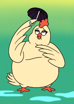
Spring Chicken

The chicken has returned.

Sunday, 19 February 2012

Review: Detentionaire

Detentionaire is an intriguing animated TV series from Nelvana and airing on Teletoon in Canada.

Nelvana is the animation house that produced one of the funniest and most outrageous animated school series in recent memory, Clone High. They also produced another not-so-funny, uninspiring school series, 6Teen. So when I learned about Detentionaire, I approached it with caution. It could be a really good series, or a complete disaster.

I just loved Clone High!
Didn't care too much for 6Teen...
Lee Ping spends a year of detention for an elaborate prank that he didn't commit, and must prove his innocence by following a string of clues while hiding from the half-cyborg Principal Barrage. So I didn't really care too much for that premise at the beginning. I was also initially put off by the tiring stereotypes, lame puns (Lee Ping = leaping?) and out-of-place sci-fi robots. Could this weird show really carry on this story over two seasons? And what's with the name... is detentionaire even a real word?

Detentionaire can be somewhat hard to get into at first, because the world that is set up is not too believable. The setting looks reminiscent of Toronto, but the believability is thrown off by alien monster janitors, half-cyborgs and some strange creepy worm mascot crawling around the school. I was not too wild about the old "jocks, nerds and cheerleaders" stereotypes that abound, and those token, secondary ethnic characters that always appear in high school shows such as this.

Also, I initially thought the character design was somewhat mildly interesting, but still looked like a cross between 6Teen and student work. And if any of you like to pay attention to animation quality, it is quite lacking here as well. I think they use Toon Boom, but those walk cycles are just terrible, and their movements still have the so-called "flashy" look about them.

Despite all this, I continued to give this series a chance to prove itself. So far, I have watched the first five episodes. I didn't even think I would watch the show this far, and expected that I would drop off out of disinterest.


Lee Ping
But let me tell you, I am really liking Detentionaire so far! I'm looking forward to watching the next episode, and the one after! Now why do I like this show...

I think it really boils down to the whole mystery format. which keeps me guessing who framed Lee Ping and why. "Well, what happens next? Why did that happen? What is that clue supposed to mean? How does it all fit together?"  The sequential storytelling format, while very common in Japan, is not that common in Western cartoons, and this makes Detentionaire even more interesting to watch.

After getting through episode three, I finally was able to step into this bizarre world and go with whatever is happening. I no longer questioned why Biffy the bully is even helping Lee, or what that worm creature is doing in the school. Probably because there is an expectation that this will be explained later. The story does get even more weird by episode five. I just wonder where we will end up by the 41st episode!

Most surprisingly for me, the characters do become relatable at some point, and not the boring, flat stereotypes they first appeared to be. Lee, despite being a whitewashed Asian with a typical Chinese mom, is generic enough of a character that any viewer could be in his shoes. There is a romantic dynamic between Lee and the school reporter Tina, and the blonde Brandy, who has an interesting fake relationship with Lee. I'm actually really curious how this love triangle plays out. And Holger, the Scandinavian sidekick, is actually hilarious! But I'm still having a hard time warming up to Camillio, the other sidekick, with his blatant Latino cliches. 

Biffy, Lee and Barrage

I have warmed up to the character designs. I don't know how the designer could pull off giving the characters such long giraffe necks! But the style does grow on me, and I think Lee has a very appealing and unique character design.

There is a sort of bizarreness I love to see in any sort of work, and Detentionaire does occasionally go in that direction of off-beat weirdness that I adore... like when Lee duels with the math club captain in a match using a Dance Dance Revolution-style calculator board. WTF! XD

Overall, this show is quite different from other school shows, and it can be hard at first to really step into the setup of this world, but the plot twists and big question marks keep me hooked. While the animation is not the best, the unique character designs are refreshing to watch. And some of the entertaining characters such as Holger make viewing worthwhile! I will continue watching this series as more episodes air.

I recommend you watch Detentionaire as well!

(I was not involved in the production of this show in any way.)

Saturday, 18 February 2012

Careless Wiener

When dog meets hot dog...

This was the final product of the Hot Dog Eat Dog project I helped work on a few weeks ago.

Created by Pencilwood Studios and Studio Phi:
Rocky Bergen - sound
Eric Hetherington - art
Stuart Hunnable - background
Rexis Liwanag - character animation
Girish Manuel - concept, storyboard, character design, comp

Copyright 2012.

Friday, 10 February 2012

Hot Diggity Dog

This is an independent collaboration with friends in Winnipeg. The project has a blog where I, Girish, Stu, Eric and Rocky share our progress.

Hot Dog Eat Dog

I am responsible for the dog animation. When it is complete, I hope to post the full video on this blog!

Wednesday, 8 February 2012

Mystic Schoolgirl

Here is an idea I have of a Catholic schoolgirl with mystical powers. It would fit the usual Shojo template of uniformed schoolgirls battling evil with their superpowers. The only major difference is that it involves popular Christian mythology, such as angel and demon characters. She is called upon to be a human fighter in a spiritual battle between good and evil. The battleground is her academy, where Satan has taken the human form of a schoolgirl.

I intend for this to be a fun series that doesn't take itself too seriously. I know that religion is a very divisive issue, and despite the fact that this idea borrows heavily from popular religious beliefs, I do not want it to promote one ideology over another. There will be absolutely no promotion of Catholic doctrine, or any mention of God or Jesus.

While I no longer have a sprituality that I claim to belong to, I was raised as a Catholic, and very familiar with the religion, some of its teachings and beliefs. I also liked to broaden my understanding of other Christian denominations and saw very big differences. Among them is the particular Catholic custom of "veneration of the saints", which some would argue is a form of worshipping dead or mythical saints. I see a lot of fun potential in playing off of this custom.

For example, if our schoolgirl harnesses the power of St. Francis of Assisi (who is officially a "patron saint" of animals), she could have the ability to communicate with animals. Silly, yes! I love it. I know it shows a complete misunderstanding of religion. But I think religion has always been easily misunderstood anyway. This is just fun!

Another element I would like to include is the popular beliefs that derive from the "Book of Enoch", which is a non-canonical book of the Bible (with the exception of Coptic Ethiopian version of the Bible). This book interestingly enough, is where most people get their beliefs about angels and demons. For example, the belief that Lucifer was a fallen angel is said to have come from this book. Raphael, who is considered an archangel in Catholicism, is not mentioned anywhere in the Bible; he is however mentioned in Enoch.

The challenge is to make it non-religious. Everyone has an opinion about religion, so I am prepared for the differing viewpoints. But most people I have talked to about this idea love it. It's probably because of all the schoolgirls!

That is another challenge... I need more feminine grace in my drawing skills. This is a great exercise for me to do just that.

Sunday, 5 February 2012

A Self Portrait

Now you can attach a face to the artwork. This is me!... or a liberal interpretation of myself.

Unlike some of the previous artwork which had some more attention to form, this self portrait is done in a graphical flat style, with huge eyes and calligraphic lines. The oversaturated colour was a happy mistake. I didn't realise I was colouring in CMYK mode, until I switched over to RGB at the very end.

Saturday, 4 February 2012

A Pint After Work

I have recently been getting back into illustration, as I get enough of my share of animation at work. This picture of Orion was drawn at the start of my temporary break from work at Studio B / DHX Media. It originally started as a doodle to help me warm up on my gestural drawing, and suddenly became more of a finished piece of artwork. I may make a post on how this evolved from a doodle.

The original drawing didn't have a gun on the table. But I figured if it weren't there, it just looks like Orion was mugged. I wanted to make him look like he has been through some action. Realistically, Orion wouldn't just have his gun laying out on the table for all to see, and guns are very uncommon in the UK. Placing the gun there was more of an artistic decision.

I also would have placed another agent having a drink beside him, but no other characters have been designed yet. There is a Commander Draco that exists, but at the moment, she is just a murmuring sound at the other end of a phone conversation.

I just really like the liberties in 2D that I can take, which would otherwise be very labour-intensive in 3D, such as the open jacket, tie, hair, etc. The stylisation of the line is something I have revisited in Photoshop, and looks very similar to how I used to ink my drawings traditionally many years ago.

I would bet that you like the 2D version of Orion more than the 3D version...?

This was another doodle of Orion, done within a few hours. It's less refined in line quality and proportion, but has a more lively style of colouring.

Friday, 3 February 2012

Codename Orion

This personal project which I have been working on during my free time is a short film to get me more experienced in using Maya. I chose an easy-to-understand premise to avoid setting up a complex story within a couple of minutes. It's a combination of subjects I like: James Bond, London, fight scenes, and coffee. Currently, this film is animated more than halfway. I intend on finishing it when I have the time.

Codename Orion: Orion's addiction for coffee has made him late for a briefing, and the sudden appearance of the dangerous Peacoat Ninjas makes this morning even worse for the half-alert agent.

Although this project is being done in 3D, I have found some technical limitations I wish I had the resources to get around. For example, I would have preferred to have Orion's jacket open, as would be the norm for cityworkers. That would have given a more dynamic, blowing-in-the-wind effect with the tie that I would like. But I imagine animating that would have been twice the work.

I am thinking about doing a 2D animated version of Orion after completing this film. I have already done lots of drawings of Orion, and am more pleased with the more dynamic clothing and hair that I couldn't do in 3D. I will post some art of Orion for you later on.

Thursday, 2 February 2012

What's the Plan

There are several things I would like to do with this blog:

-Share my artwork for anyone to comment on
-Give some personal insight and tips for different drawing techniques and knowledge
-Create discussion on animation and the direction in which the industry is heading

This blog should be informative for you, but I really hope that it will be informative for me as well. I am always curious about the future of animation, especially at this evolving time of digital media, the ease with which animation can be created, and the rapid change of copyright law, among other things.

I'm also planning to show you how I draw. As much as I have held off of making tutorials (because there are just so many bad ones out there), I would like to think of this as just sharing my techniques on how I draw. Teaching technique is apparently something I can be good at, so I may as well share some of my knowledge.

You will also see some artwork by me. I have several ideas I want to flesh out here, and I would appreciate your input!

Right, here's the obligatory life drawing to get it started.

five minute sketches 2011

half hour drawing 2011

twenty minute drawing 2011